How ecommerce design has evolved in 2016
It’s kind of fun to look at websites from the dim and distant dawn of the internet. Single-column layouts, web-safe fonts, crude CSS—web designers in the early 1990s were pretty limited in what they could do.
You don’t even have to look that far back to see how things have changed. In just the past three years, the look and feel of the internet has shifted perceptibly. We’ve watched web design evolve from skeumorphic to flat to material. Things like microinteractions and large hero areas have become popular, while textured backgrounds and magazine layouts have fallen out of favour.
In design, as in life, it seems change is the only constant.
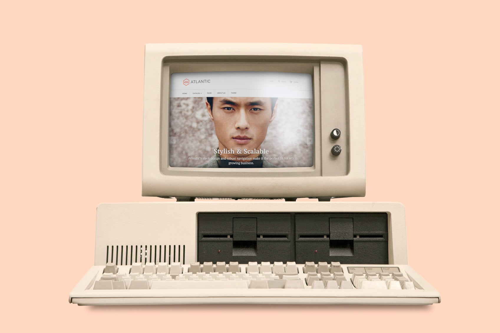
When we launched our best-selling Shopify theme, Atlantic, in June 2013, ecommerce design wasn’t where it is today. Back then, product views were static and singular. Headers belonged at the top of the page. Heck, “full-width” meant 1,000 pixels. Atlantic may have been cutting-edge when we unleashed it on the world, but three years later? Not so much.
We thought it was high time we brought Atlantic up to 2016 standards—and that's exactly we did. Atlantic 2.0 (or 10.0.1 if you’re really keeping track) has all kinds of new and noteworthy features, including an unobtrusive sticky header, improved product filtering, a wide display option, and even some fresh new icons.
To celebrate the Atlantic update—and to provide a bit of context for those of you whose online stores were designed a few years ago—we thought we’d give an overview of some of the key shifts in ecommerce design over the past few years, as well as some ideas for how you can take advantage of them.
Social integration has boomed
Sure, Facebook has been around for well over a decade, but it’s only in the past few years that ecommerce merchants have been pulling content from social networks into their online stores. We don't mean putting a Twitter feed in your footer or adding social sharing buttons to your blog posts; we mean syncing your entire social media experience with the products or services you offer.
What does that look like from a design standpoint? One popular approach is creating space for user-generated content. Apps like Pixlee and Curalate let stores flag and moderate visual content from their customers and display it in a feed or “fan reel” on their site. Some stores embed these images in the product listing itself, or use a hashtag to link to photos of that product on Facebook or Instagram.
This practice gives shoppers an idea of the popularity of the items they’re considering, as well as how they can be styled or used “IRL.” For merchants, it also means a steady stream of fresh content coming in—a signal to both visitors and search engines that their brand is active.

Free People uses Instagram on their product pages to give a "real-life" look at their products.
Another feature merchants are increasingly demanding is social sign-in and social-based review and commenting systems. Sure, it’s nice when a customer takes the time to create an account tied exclusively to your store, giving you full access to their contact and demographic information—but it’s also a barrier to purchase.
Social sign-in removes that barrier, allowing a customer who’s already signed into a social platform to use that account to make purchases, track orders, and review items. Researchers have even found that shoppers who use social sign-in spend more time on-site and have higher average order values than users who don’t. Plus, it makes the whole browsing and buying process a lot more lively, letting people share comments about your products directly to their social networks.
Large hero areas and full-screen backgrounds rule the day
“Go big or go home” has never been more appropriate than it is in today’s world of retina displays and immersive design. While a few years ago designers relied primarily on image slideshows to carry the hero area (a term borrowed from print advertising to describe the full-width area at the top of a page), these days it’s all about full-screen images, illustrated artwork, and even video.

Everlane does a nice job of showcasing their latest collections using a two-tone hero area.
It's not hard to find examples of of large, oversized hero images being used to introduce ecommerce companies. Frank & Oak, Nisolo and Everlane have all taken advantage of the trend to bring their products to life, placing a strong focus on visuals, with simple typography playing a supporting role. Navigational elements and secondary type generally keep a low profile at the top or outer edges of the page to keep customers focused on the image and call to action.
Many stores opt to update their hero images every couple of weeks. Rather than have it act as a static, standalone image that encapsulates their entire brand, they use it to advertise new products, limited-time promotions, and even blog content. The only thing you need is a standout image, illustration or video.
Interactivity is on the upswing
The introduction of HTML5 in 2014, coupled with an increased use of JavaScript and CSS3, has allowed a more engaging and interactive design standard to emerge. Whether that means slick transitions, novel scrolling dynamics, or more inviting popups, ecommerce sites these days are expected to inform customers and wow them.
Interestingly, this isn’t the first time animations and popups have taken web design by storm. In the early-noughties, attention-grabbing Flash animations and popups were everywhere. Remember the miniature salesperson strolling onto your screen to welcome you to their site? Or the links that triggered dozens of new browser windows to open with ads? It was maddening.
These days, designers are taking a more subdued approach when it comes to interactivity and “interruption merchandising.” We’ve seen techniques like parallax and ghost buttons used to build richer, more engaging user experiences. In-browser pop-up modals are now being tactfully employed to capitalize on “micro-moments,” typically offering customers a discount in exchange for joining a mailing list or completing a purchase right that instant.

Beth Richards uses popups to engage customers with special deals and discounts.
Pre-2013 sites tend to use less of these design features because they were built at a time when browsers simply couldn’t handle them. Comparing an older site to a newer one, you might notice the older one seems a little “clunky” compared to its modern counterpart. Transitions are smoother now, animations more subtle, popups less disruptive. Why settle for a jalopy when you can drive a Jag?
Responsive is the new default
In the early days of smartphones, it was enough to have a simplified “mobile” version of your site that rendered properly on an iPhone and tablet. Then Google released the Android phone. And Apple released the iPad mini. And before long, there were literally hundreds of different-sized devices and more people searching from mobile than from desktop. A single mobile site was no longer ideal.
To address the problem, web designer and developer Ethan Marcotte came up with “responsive web design,” the idea that sites should be designed “to be viewed across a gradient of experiences.” His introductory article on A List Apart was a hit, and before long fluid grids, flexible images and media queries were allowing designers to automatically fit websites to a variety of devices and screen sizes.

In 2016, every ecommerce store should be optimized for every device.
And yet, it’s only in the past few years that we’ve begun to truly realize the aims of responsive design. It’s not just about screen size, but the way we interact with content when we’re not using a desktop and mouse and lightning-fast internet connection. To design a website responsively in 2016 means a host of design considerations that are fundamentally different from any other medium, from how much content we cram onto a page to how we activate it.
You could reasonably argue that no one’s created a truly responsive website yet. But we’re figuring it out. In a 2013 article on responsive design, Smashing Magazine wrote: “We have to find new defaults, new starting points for our design process." Three years later, it would seem we’ve found at least a few of them.
Going forward
These are just a few of the areas in which web design has changed over the past few years—there are definitely others we didn’t have time to cover. While it can be challenging and expensive to keep on top of the latest design trends, falling behind can quickly become a drag on the credibility of your store. For now, keep your site looking fresh by making sure your images are large, your design clean, and your opportunities for customer engagement at the front of everything you do.
Good luck out there!